With the popularity of fantasy films today, it’s best to know how to color grade ordinary-looking clips and turn them into a scene in a fantasy world.
I’ve never seen 2 fantasy movies that look exactly the same. The differences are noticeable and make that movie own a certain look. It means that there are thousands of varieties and combinations you can do to create a fantasy look.
[embedded content][embedded content]
In grading this clip I had ‘Jack The Giant Slayer’ and ‘Lord of the Rings: Rings of Power‘ in mind.
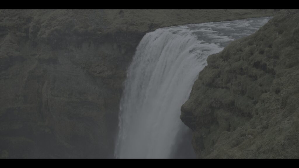
The Log footage is suggesting a dark and moody look, which I really love, but I wasn’t going for that. If I was going for the ‘House of the Dragon‘ look, this would’ve been very quick.

This is after doing some corrections and adding two Gradient Power Windows to add that bluish-green look. At this point, I could’ve just added sharpness and Film Grain and this could’ve passed as a Fantasy Forest Look.
However, I wanted to create something more unique that if it’s a real film, it can be considered that film’s brand.

I decided to go with this look. I’ve never seen this kind of look and it gives a different emotion than the previous look. It’s not so blue but it suggests mystery and danger. Since I was thinking of Jack The Giant Slayer and Rings of Power, I created something that will fit the same genre.
General Tips for Creating a Fantasy Look
Creating a fantasy look can be quite deceiving so here are tips I can give you.
It’s not always saturated
After obsessively studying different looks, I learned that most fantasy films aren’t really saturated. The reason why it feels saturated is because of the color separation the colorists create.

If you’re going to look at the still above, you might think that it’s saturated because of the number of colors that are slapping your eyes.

But, looking at the vectorscope, it’s clear that this image isn’t that saturated. It’s not desaturated as well.
Just don’t be tricked into thinking that you have to pump your saturation just because it’s a fantasy look.
No matter if the final look has a lot of overcasts, don’t skip color correction
You might think that it’s ok to simply desaturate the image and add the overcast. Don’t.
2 Reasons. 1st is because it won’t have the same depth as the scenes without the overcast. Thus, it’s difficult to match the scenes perfectly. Second, if suddenly the director or the cinematographer asks you to remove the overcast, you have nothing to show but a black-and-white version.


This is a beginner’s mistake so I’ll include this here. If you have this kind of scene where there are lights with random colors, you don’t have to make it neutral before grading. Correct them in terms of contrast and saturation but you don’t need to remove the colors.
Have different color grading inspirations
I don’t call them references because I don’t really reference my grade to them. I use the stills or the films to see the industry standards and create my grade around them. Films have their own language and what might seem reasonable in real life won’t be the same in films.
Experiment
As colorists, we are painters. We paint movies. Famous painters discovered different amazing painting styles by experimenting. They don’t have Udemy courses back then to tell them what was right and wrong. They only have a blank canvas and a paintbrush.
We have DaVinci Resolve or Baselight. These are really powerful tools. I’m sure that there are a lot of strategies, color grading techniques, and color palettes for films that haven’t been discovered.

I don’t like to be the guy to teach you how to copy other people’s grades and adjust from them because that would be too lazy. I also consider it very incompetent. If you are the director would you hire yourself if all you know is to recreate other people’s works?
One of the strategies you can use is to simply exaggerate the part you’re adjusting. For example, you’re adjusting your saturation. If you think the saturation is already perfect, try pumping it more until it feels gross. Then, pull it back. In this way, you’ll discover things that may add to the look you’re creating. Do it with other adjustments like contrast, temp, etc.
Conclusion
Creating a fantasy look isn’t really that different from color grading other films. The difference is just the color palettes you’ll have to use and if you’re working for a big company, you might need to deal with more visual effects.