This might be my first time creating a color-grading review or analysis of a film or TV series. We just finished watching the whole 8 episodes in one sitting and I really think that the color grading was brilliant!
I’m not saying it’s perfect because I’ve seen a lot of scenes that, for me, have blue overcasts. I think that the color grading is brilliant because it appealed to all ages. My daughter never watches horror movies or anything scary but the look was so intriguing to her that it feels like watching a Disney film.
I’m 100% sure that she would’ve wandered off if the color was pale and gothic.
The bright and colorful night scenes are so refreshing to the eyes.
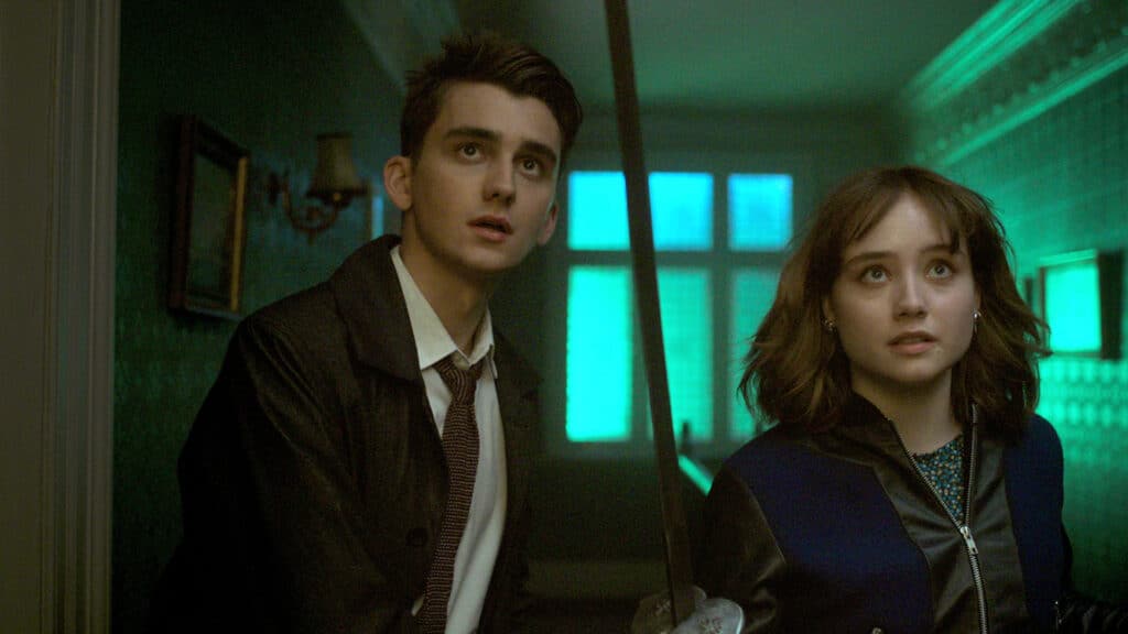
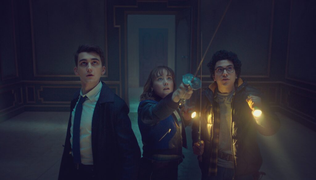
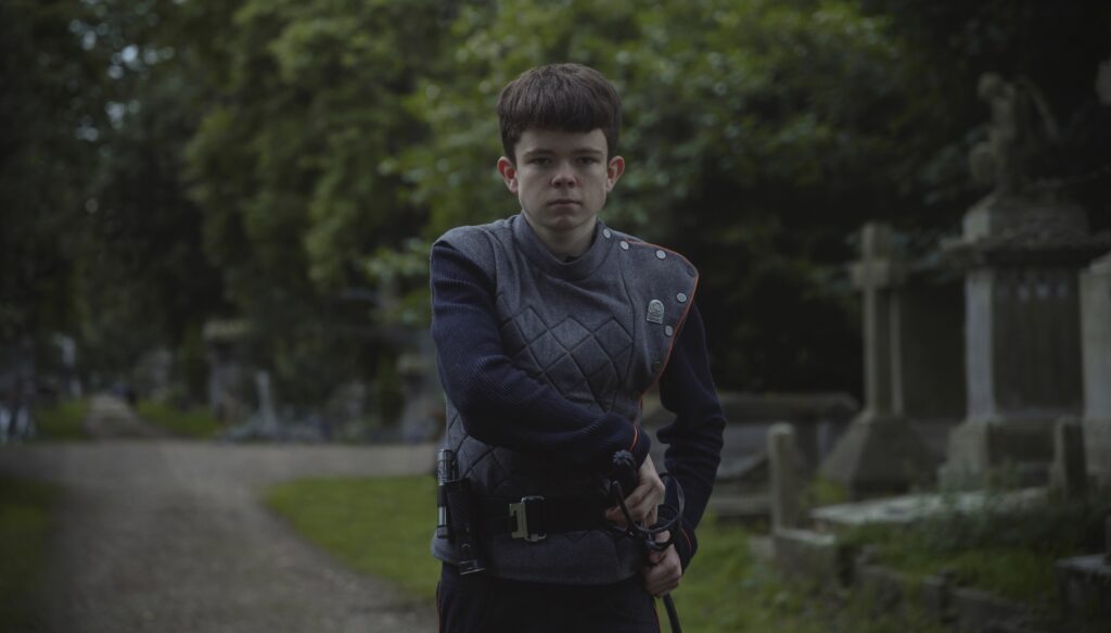
This is one of the first scenes in Lockwood & Co. and right away, you feel like it’s something interesting and fun to watch.
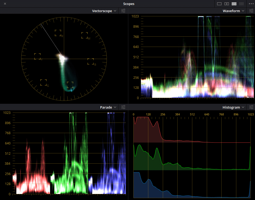
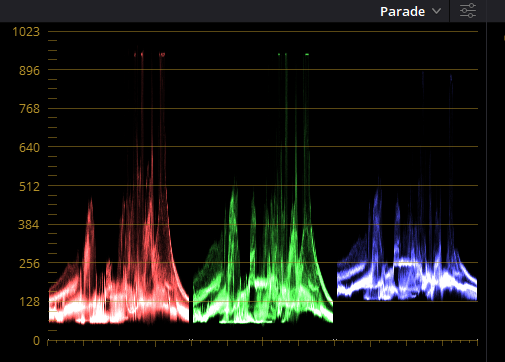
Looking at the scopes, it’s hard not to notice how saturated they made the green. And, that’s not normal for a thriller or horror film.
That move is brilliant!
Imagine if it was graded something generic for a thriller film. Something like this:
I would definitely watch that since I love thriller films but I think that it won’t be as catchy to most people. Also, the vibe would be darker and the effect on people will not be the same.
What we felt watching the show was excitement and fear combined. Changing the look to something generic would just make people feel fear and suspense.
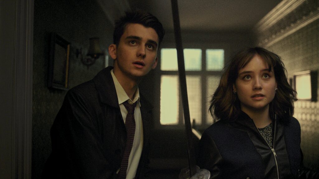
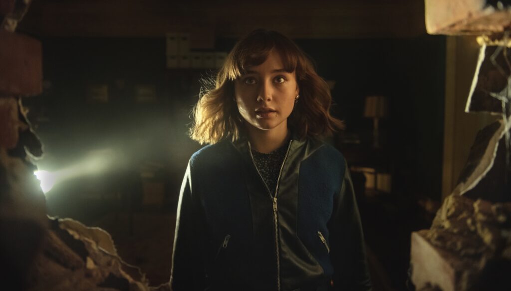
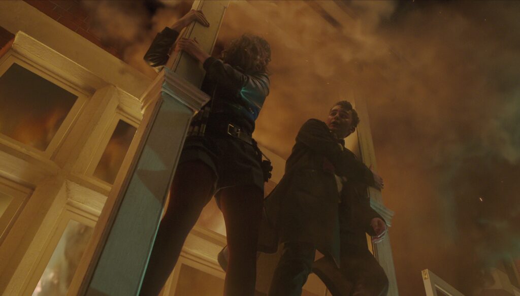
Contrasty but milky blacks add to the feeling of mystery
That first scene was one of the few scenes where the blacks aren’t milky. Throughout the film, the blacks are so milky that you don’t see the edges of the subjects.
This is a good technique to make the viewers focus more on the story rather than the details of the subjects.
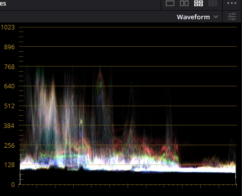
Just see how lifted the blacks are in the scope. It’s so close to that 128 lines. In most Feature Films, you’re going to see the blacks will be near the zero line. Some of them have their blacks crushed.
It means that the blacks are below zero and the details of those blacks are completely gone.
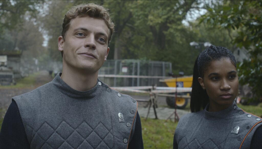
Maintained warm skin tones in cold scenes
Most of the time, the skin tones become pale or bluish in cool scenes. But here, they maintained warm skin tones.
Another thing I noticed is that the blacks aren’t pure blacks in most scenes. Most professional colorist knows that it’s best to keep the blacks “real black” or without any overcasts.
One of the reasons is that it feels not realistic enough having a bluish-black. Also, the objects in the image will have less depth.
The amazing thing about this film is that they made everything work even with those flaws.
Below would be a generic way.
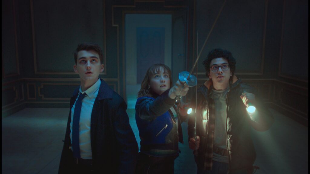
The blacks are pure black. The skin blends with the scene. The flash light’s light also blends in. However, it wouldn’t have been as interesting as the original version.
Desaturated mornings
Mornings are when most research, discussions, analysis, and other not-so-exciting actions in Lockwood & Co. I don’t know if it’s intentional but having these scenes desaturated is great.
First of all, it gives us a break from all the saturation our eyes felt from all these ghost-fighting scenes. This is another way of creating contrast in the film. Most of the time, colorists will make warm mornings and cool nights to create contrast in films.
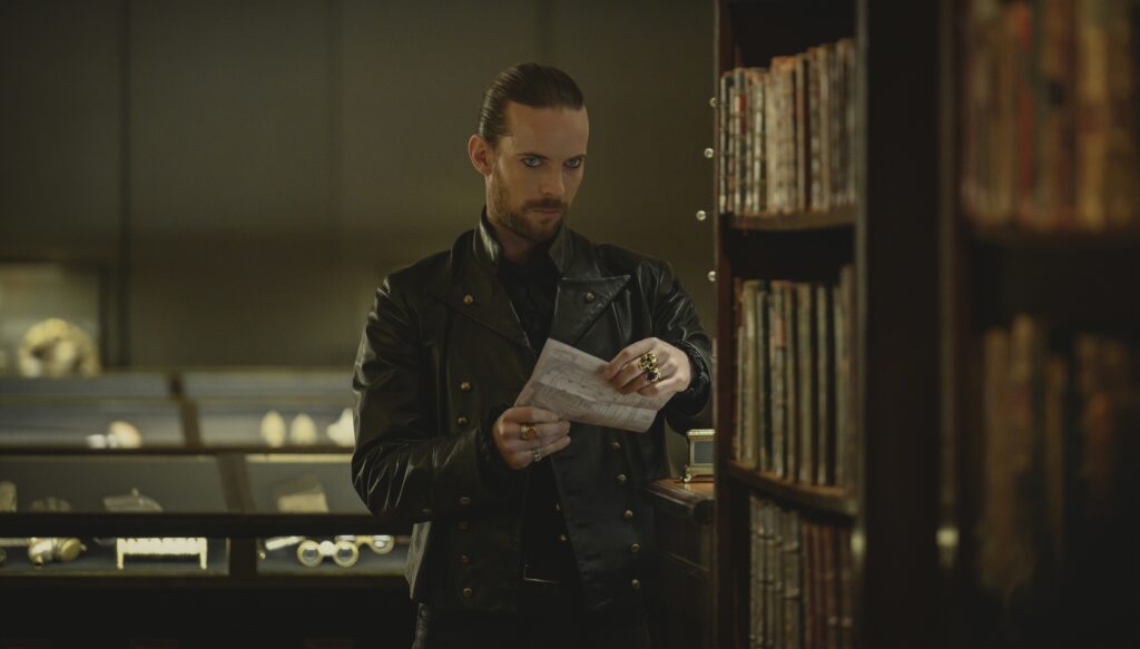
Consistent subtle brown orange
One way of keeping a film feel consistent is to have a specific color in the frame most of the time.
It can be as small as a coffee cup but it will be intentionally placed in a scene or it can be the main color in the scene.
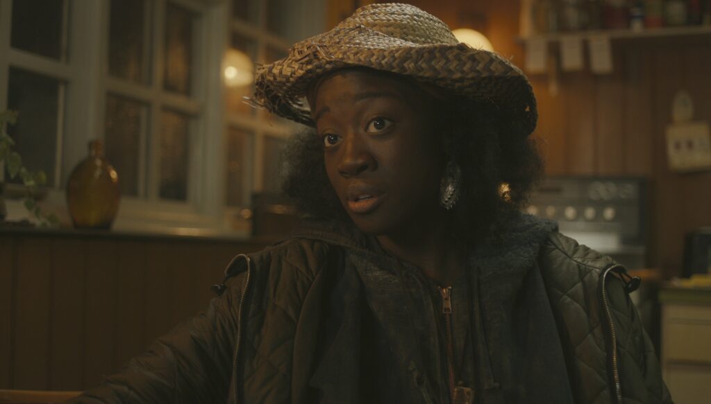
See how the fire has the same orange color as the indoor wall lit with a lamp and the skin of Lucy in the second still. This isn’t a coincidence. It’s a colorist doing its job maintaining the DNA of the film.
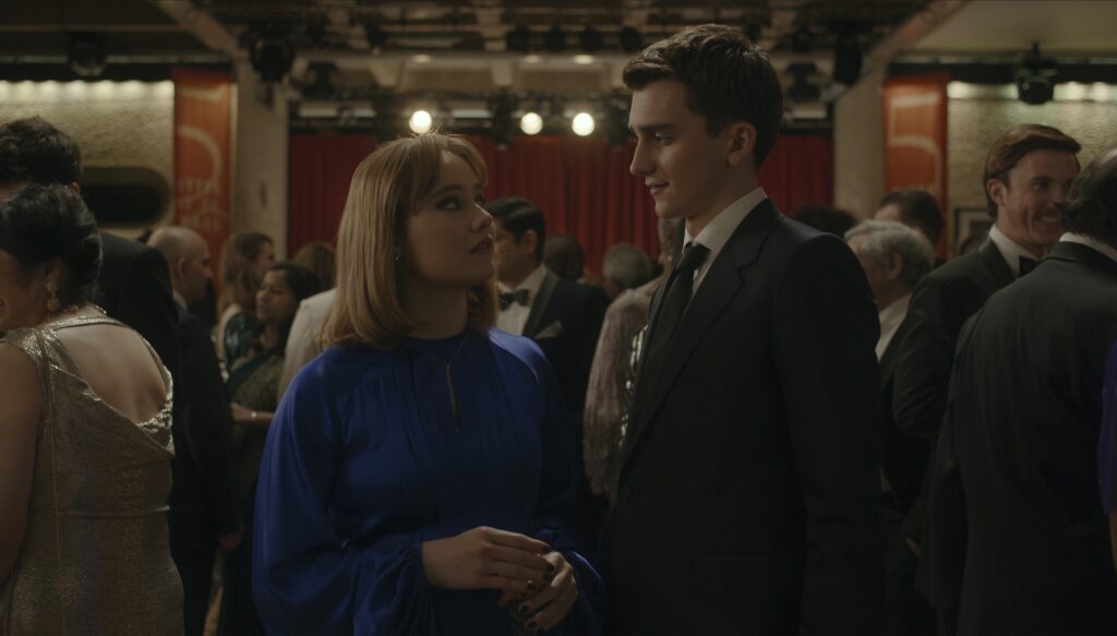
The texture feels so smooth
It feels like they reduced the Mid/Detail a lot. When I’m grading, I’m very particular about making the audience feel like they can touch the objects in the frame. In the stills below, I would’ve made the tuxedo and her blue dress crisper.
Here, I’ll remove the overcasts on the books so it’ll feel more like you can get the books.
I could’ve just made the skin smoother by selecting the skin and adjusting the Mid/Detail only on that certain node. The only problem with that is it’ll take really more time.
Maybe the colorist of this film wasn’t given that much time to grade all the episodes so he went to just making everything smoother instead of just the subject’s skin.
Watching the film, as a colorist, I couldn’t help but notice it when the scene turns really smooth because I’m very particular with sculpting the scene to make them look realistic even with heavy grading.
This and the overcasts are some of the things I noticed that I think would be nice to improve however the film was 10x better because of the grading. I checked IMBD for the colorist of Lockwood & Co. and it wasn’t mentioned. Otto Rodd was credited for color workflow so he might be it.
Conclusion
The colorist of this film did a really great job in that it made the film create a feeling of fun that it doesn’t feel like watching a horror movie. I got so inspired by this work that I created a color grading review article about it.
Learn more about color grading here.