Ok, you mastered DaVinci Resolve Studio and you can now create any grade that you want. You land your first client, he told you some instructions and you started grading.
When you sent the graded video back, he wasn’t satisfied with the grade.
What went wrong?
I’ve been there before and, like you, it really feels bad and it’s time-consuming to regrade everything again. With the steps I developed along my remote color grading journey, you’re going to receive positive reactions from your clients most of the time.
Yes, they will still have comments and revisions. But, these revisions will all be just minor tweaks and you won’t have to start from scratch again.
Respect The Director’s Vision
You have no idea how many times I wanted to create a different version from what the clients wanted. Our job, as colorists, is to mainly fulfill the director’s vision. Yes, we can be as creative as we want but it’s only if it’s within the scope of what the director wants.
There are directors that will tell you very detailed instructions but there are also directors that only want one specific thing.
For example, I have a client who wanted a dark moody yellow look that resembles “The Enemy” but should have an original punch to it. I also had a client that just wanted the main color to be green.
If you’re the colorist of the first client, you don’t have that much room for your creativity. Create a look that satisfies him and go shot match everything. However, you still have a lot of decisions to make like how to shape the light in every scene, how different light sources affect the subjects, how to make the flashbacks look different but feel cohesive with the entire film, etc.
I created 5 different looks for a client. The first one was my least favorite among the 5 but I was so shocked when he picked that first one.
We have different tastes and the director is the one paid by the producer because they trust him. And our job is to help the director achieve his vision for the film.
Ask for a Reference Still, Image, or Film
What? Didn’t I just say that we’re going to create a unique grade?
Yes, we will.
The reason why the reference file is important is because it’s so difficult to explain by words alone the type of grade you like.
One of the most common requests clients tell me is to create a “warm look”. Trust me, all these clients wanted different looks. There are clients that wanted a very orange look that is almost like an overcast, there are also clients that just want a hit of warmth on a well-balanced grade. Other clients want the skin to be warm even though there isn’t any motivation on why they are warm, other clients want the warmth to be motivated by a certain light source.
The reference file can also help you land the unique look faster.
Right now I’m grading 3 films. Yes, it’s possible since it takes some time for the director to check the film and place their input into the grade I created.
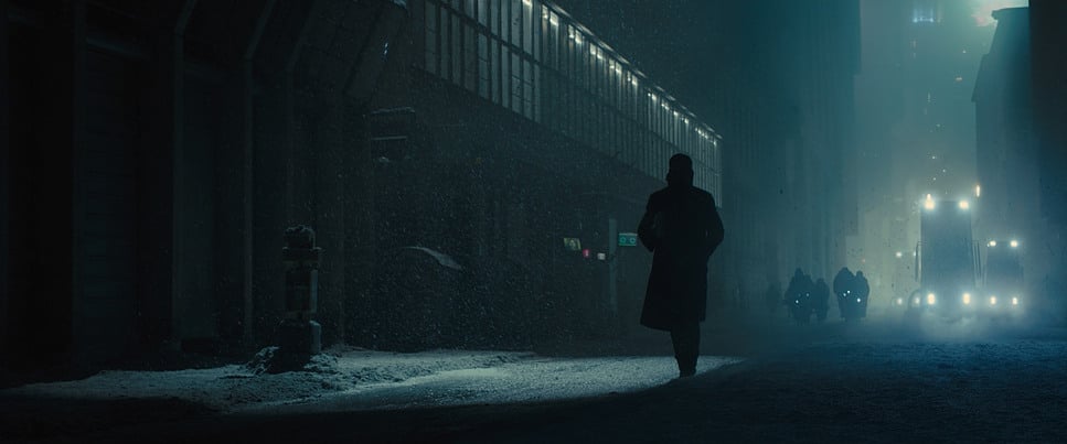
Going back, I’m grading 3 films and 2 of them wanted punchy looks like that of Blade Runner 2049 and the other one wants low saturation.
After grading the 2, I started grading the 3rd film and because of my muscle memory, I created a punchy look. But, I remembered that the client sent me stills of films that he wants. I revisited them and because of that, it saved me from wasting more time on continuing the punchy look.
Watch the Reference Film, if Possible
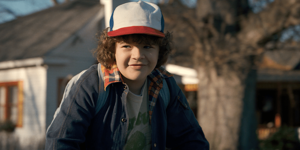
A client told me that he wanted something like Maleficent. He even gave me stills. I could’ve just gone and started creating looks based on the stills.
However, the client doesn’t want that color palette. He wants how the film makes the viewer feel.
If you shot to match the film completely, it may work but you, yourself, don’t know how to feel by watching the film you graded.
Luckily, we don’t have to go to the theatre or rent DVDs to watch these films. We have Netflix, Disney+, Hulu, etc.
We have a Disney+ subscription so I simply searched for Maleficent and watched the film. I created a look that satisfied the client right after watching the film. I didn’t even have to use a reference still to create one.
[embedded content][embedded content]
That’s because after watching a film, you’re going to have an inner bias on how you’ll want your grade to look which is a good thing if you’re going for a similar look.
But, if you watched something very different and start grading it to look like Maleficent, you’ll see very different results.
This is a million-dollar trick and I highly recommend doing it on your next project. If you can’t find the film on any of these platforms, the next best thing to do is to watch a trailer from Youtube or IMBD.
It’s not as powerful as watching the whole film but at least, you’ll have an idea of how it should feel.
If you grade based on feelings, you’ll have more success. A successful film touches the heart and your grade will help that film achieve that.
There are more than a million looks that can be created in a single clip and I’m not even exaggerating. You can just move your offset slightly and that will be a completely different look conveying very different emotions.
Start by Balancing the Image
But, the most successful image I created was mostly started by having a balanced image first.
When balancing the image, what I suggest is to look at the main subject and make sure he or she is popping out. A slight overlay will cause the subject to blend with the background.
Some may say that they don’t need to balance since they’re creating a monochromatic look.
Just try this, create a balanced image then set saturation to zero to make it black and white. Do that to the unbalanced image, as well.
Which has the better black-and-white image? If you say it’s the desaturated balanced image. The same thing happens to a monochromatic look. You’ll have a way-better monochromatic look by just balancing it first before grading.
There are times when you don’t need to balance before grading. For example, the cinematographer used an orange gel to create a warm look that’s already close to what the director wanted.
In post-production, you don’t need to balance it. You just have to enhance the image and do the other things that are needed to make the film look the way it should.
Prioritize the Skin Tone First
I learned this from one of Walter Volpatto’s training. He makes sure to balance and grade while prioritizing the skin tone. He doesn’t care about the sky if it’s green, or the background if it has overcasts, he makes sure that the skin tone goes to the direction of the look first.
Who’s telling the story? It’s not the sky, the red vase in the background, or the environment. It’s the subject that’s telling the story.
Based on experience, it’s easier to grade when we don’t have to select the skin tone for grading. I usually select the skin tone just for retouching the subject’s skin.
This is another million-dollar technique that will make your client satisfied with the grade you’re creating. A slight mistake in the color of the wall won’t get you persecuted but a slight mistake in the subject will be very distracting to the viewers. Even non-filmmaker viewers will notice them.
Create 20 Different Looks Based on the Client’s Instructions
One of the fastest ways to create a unique grade for your film is to match your clip to the reference file as closely as possible, then based on your taste create different looks from that point.
I suggest creating as many as you can. I usually create 20 looks and show my clients the best 3.
Why that many?
The reason is that when color grading, you’ll have an inner bias because of the efforts you’ve made. That will make you believe that the grade you created is already the best.
Creating 20 different looks and aligning them will allow you to compare them and be more objective with your decisions.
Having no point of comparison, you’re going to miss a chance to land the best look possible for the film.
Even though, you created something that you think will be best for the film. Go and create 19 more.
Use Collaboration Tools for Checking
I was using Vimeo up until last week but right now, I’m using my recently discovered tool, Frame.io. What I liked about Frame.io is how easy it is for clients to put their comments on the exact frames where they want to add their comments.
They don’t need to describe to me the scene like “I’d like to brighten up the scene where the boy is crossing the street.”
They just need to pause to that frame and then write their comments.
Without tools like this, you and your client will waste a lot of time uploading and downloading. Invest in these tools if you’re going to be a remote colorist and your clients will have a great experience with your services.
Also, pro tip. Encourage your client to be honest with their comments and tell them everything they’re thinking. I usually tell them “I want to fulfill your vision and I’ll really appreciate it if you’re going to tell me everything that you need to be changed in the grade.”
If you don’t encourage them to tell you their comments, they may feel like they’re being rude or something by doing so. What you don’t want to happen is to have a client book another colorist instead because you’re not getting what they want.
You can prevent this by encouraging them to be open with you all throughout the time you’re color grading for them.
Conclusion
It might be a daunting task for colorists to satisfy clients but when you follow the steps above, you’ll land that perfect look 10x faster than it will usually take.
I created a remote color grading company without having any local client experience and I realized that it’s very possible. In my next articles, I’ll be focusing more on dealing with clients since these things are very important but rarely taught.