I’ve been working as a colorist for a while now. I grade mostly short films and feature films but along the way, I receive inquiries for commercial videos, music videos, documentaries, and even vlogs.
I just noticed that I never received an inquiry for color grading a travel video.
Maybe because people who are creating travel videos don’t feel the need to professionally grade their videos. Most travel videos are going to be uploaded on Youtube and will be shown mostly to friends.
I totally understand this and that’s why I created this article. I want you to wow them on your next travel video.
We recently went to Universal Studio Japan for my daughter’s birthday and I intentionally used an old camera to prove a point. Color grading can make your clips from cheap cameras feel like a big budget.
[embedded content][embedded content]
Pick a visually appealing color palette
Color-grading travel videos are different from color-grading short films. The term cinematic is also used in travel videos but it may look nowhere near any Hollywood films. Cinematic should mean “like Cinema” but most of the famous travel video creators created different looks and labeled them cinematic.
I have zero problems with that, though.
When creating a travel video, you can’t really recreate Hollywood films because the purpose is different. Hollywood films can desaturate an image, crush the blacks, or do anything that may make the image less visually appealing because the priority is to tell the story.
If you’re going to create a travel film, you want to basically “Wow” your audience in every frame of your film.
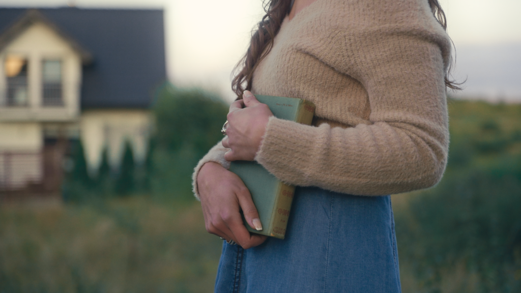
One great way to do this is to pick a really visually appealing color palette. In the USJ video, I made for my daughter, I used blue and yellow as the main palette but with a twist. Instead of making the sky blue and complimenting it with yellow, I made the sky yellow.
Doing this makes the video look more interesting because it’s not something you see every day. It’s perfect since my daughter is wearing a denim jacket so complimenting the yellow with blue is easier.
Why is it important to choose a palette?
It’s such a pain in the butt to stick to a color palette when color grading but it’ll make your video look consistent and will give the audience a great time watching them.
How would you feel if you’re watching a film with a John Wick look, but it changes once in a while to A Walk to Remember look?
It doesn’t connect in any way. It will be very distracting and it looks very amateur.
Did I mention that a vlogger asked me to color-grade her vlog? One of her reason is that she shoots a lot outdoors and the light is constantly changing. She wanted to make her vlog have a uniform look from start to end.
Of course, you can’t force your palette to all of the shots. Like in the video above, in the Harry Potter area, I couldn’t force the blue and yellow but it still felt consistent because in the undertones I still added some blues and the contrast remained the same.
Create a good color separation
Some people who don’t know what they are doing will move the temperature and tint, or even the color wheels to one side and call it color grading.
Creating an overcast on an image can be useful for some scenes but having overcasts on most of your clips will just look very amateur and icky.
Creating a good color separation helps create depth, makes the subjects pop out, and most importantly it’s very visually appealing.
Don’t think that moving the offset to one side will do the trick. Colorists are paid thousands of dollars per project. Surely, we don’t just move the offset and get paid because that will be the biggest sorcery ever.
If you have a yellow top and blue pants, you don’t want your yellow top to be a blue overcast. You want your yellow to be as different as possible from your blue.
Looking at the example below, you can tell that there is a slight warm overcast in the entire image but that doesn’t affect the color separation of the image. If the overcast will cause the image to feel flat and make the color of the overcast obvious, that will be something you should avoid.
Consistency
Maybe I’ve given a hint of this in the first part about the color palette but consistency isn’t just about colors. It’s also different parts in an image that creates the DNA of the look. Some of them are contrast, black levels, highlight roll-off, and saturation.
Take a look at these different stills I graded below.
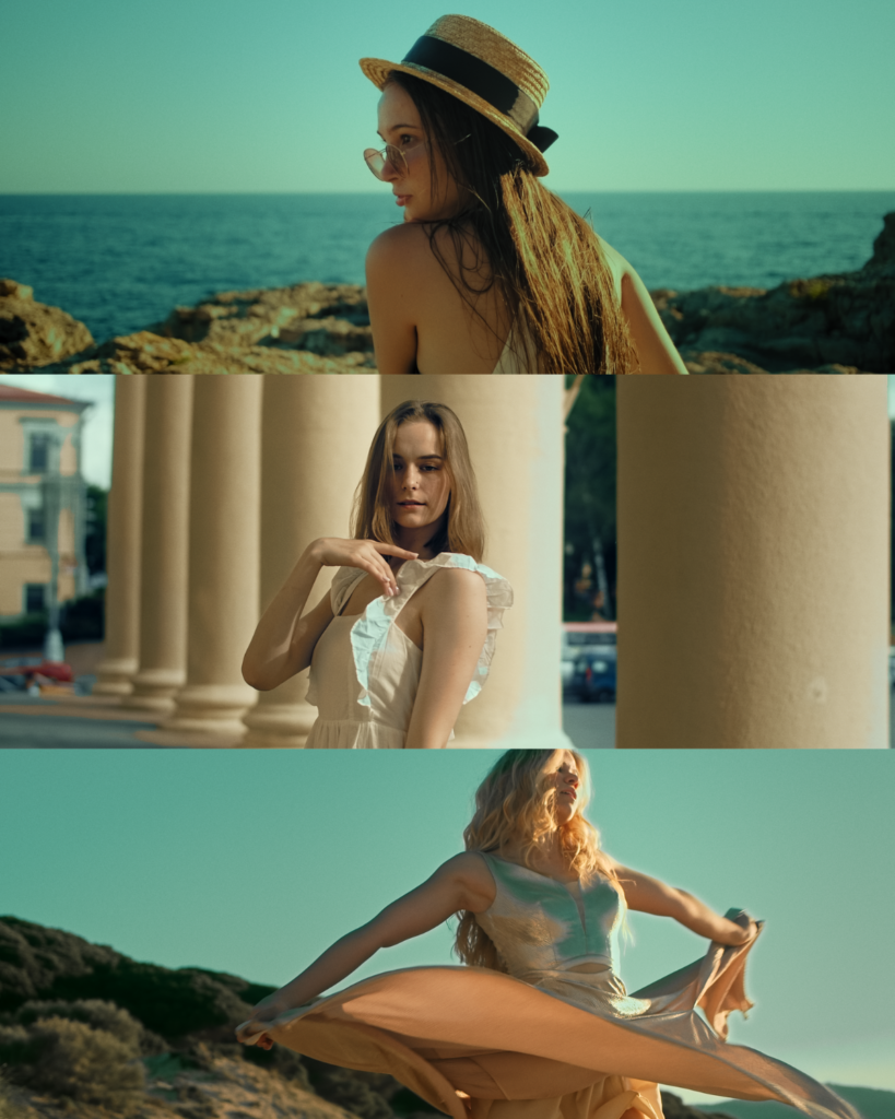
These are different shots, filmed with different cameras, and different models but if these clips are to be placed in a single film, the audience won’t be distracted because they have the same look.
They don’t have to exactly match since there will be different scenarios, different lighting, etc. They have to feel right instead of looking perfectly matched.
These are things that can be well understood by taking color grading courses.
Make them look unreal
In feature films and short films, I create looks that are visually appealing but don’t distract the audience but in travel films, it’s okay to push the colors and create looks that aren’t realistic.
People who are watching travel films have a different purpose from watching Netflix movies. The travel film audience wants to be Wowed most of the time. That’s why you see the sea water becoming really blue, you see the desert becoming orange-red, etc.
One of my favorite travel video creators is Sam Kolder. He is a perfect example of creating unrealistic looks and wowing the audience.
[embedded content][embedded content]
It’s okay to create these pushed look with travel films.
Be in your audience’s shoes for a moment. Imagine, they are tired from work or stressed out, and they opened up Youtube to watch a travel video. They looked for a keyword like “Universal Studio Japan and your videos appear.” They opened it and everything looked normal. Unless it’s a Vlog, chances are, your audience will be looking for another USJ video to watch.
Even if you don’t create something unreal, make it look interesting enough to captivate your audience.
Master using the secondaries
If you’re filming using old cameras, you’re not gonna have the luxury to mask out things. The trick is in the secondary curves. These are hue vs hue, hue vs sat, etc.
You can create stunning looks by just using these curves. Instead of masking the denim jacket and changing the color to using the color wheels.
Go to hue vs hue and adjust the hue of the blue. Moving the blue curve upwards gives you a teal look that is very useful in creating orange and teal looks.
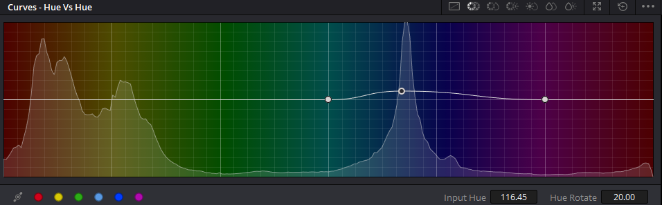
These are tools that even professional colorists are using in Feature films. We use the tools that will get us to the goal faster. If it can be done using the curves, why use the qualifier? Unless you’re going to create something with it like adding texture to the denim jacket.
Use one node each to qualify the highlights, skin, and shadows
If you’re using DaVinci Resolve, this trick will benefit you a lot.
Create a parallel node just like this.
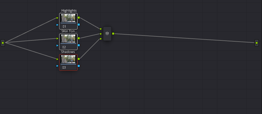
This will be a very general selection to even in 8-bit footage, you can do this.
Now, when you qualify the highlights, you’re going to select mostly the sky or the bright lamps indoors. You can lower it down to have a better highlight roll or add a bit of color to the sky.
For the skin tone, try to create a great selection but if not, select more of the mid-tones so that you’ll include all the skin. You can adjust your mid-tones slightly as well.
For the shadows, if you select them without selecting your mid-tones and highlights, you’re going to be able to have more freedom in adjusting them like making them milkier or crushing them. This is very useful when you are already satisfied with everything but the shadows.
Try these things out and you’ll see a drastic improvement in your travel films.
Conclusion
As far as I’d like to teach you more about color grading, it’s best learned in color grading courses. I personally recommend Freelance Colorist Masterclass if you’re a complete beginner. At the end of the course, you’re going to feel confident in your decisions in color grading any film you create.