
I saw a post on Instagram lately about how the Director is grading his own films. I was totally cool with it because most indie filmmakers are usually lone soldiers in the beginning.
He was posting stills and teasers and there are several things that I thought could’ve been improved if it was handled by a professional colorist.
I was shocked when he announced that this film was to be shown on Amazon Prime Video and in Theaters.
I understand that hiring a colorist can be costly and time-consuming but you already spent a lot on the film. People, aside from you, had worked so hard for this film. The actors, the crew, producers, marketers, etc.
But, the most important thing is this. This film is one of your life’s work. Time will pass and you’re going to look back on your films and say “I should’ve hired a colorist.”
So, let me tell you things that will reveal that your film isn’t professionally graded.
Inconsistent looks
The easiest way to see that your film isn’t professionally graded is when the looks aren’t consistent. This one is also one of the most difficult steps in color grading. There can be 2 shots in one location and lighting condition, and yet you’ll have to do several corrections to match them perfectly.
Like how basketball players train their shooting or dribbling every day, colorists train their eyes every day to make shot matching seamless. I discovered that after mastering the color grading hardware, you’ll never be a good colorist if you don’t train your eyes.
On top of that, colorists use scopes to make sure they’re matching. Colorists use a separate monitor just for the scopes because it’s that important.
After grading an entire film, I usually watch the whole film at 2x speed while tweaking. Then, rewatch it again until I don’t have to tweak anything anymore.
Also, have you tried grading a film or even just your travel video and thought it was okay? Until the next day, you’re like “What the heck was I thinking? This is garbage.” I’ve been there and I still experience it at the moment. So, having short breaks is a must!
No Sense of Space
Sense of space is something that most seasoned colorists overlook. Imagine when you were a kid drawing an apple. If you draw just the apple’s edges, you get a flat-looking apple. When you add a colon shape on the upper right side of the apple, it feels like the apple is 3D. When you add shadows, it feels more real and you feel like the apple is on top of a shelf and the light is beaming up on it.
Without drawing the shelf or any other object, you feel that the apple is occupying some space on a certain surface.
If you draw a smaller apple beside it, it feels like they’re side-by-side. But, if you make the smaller apple have more shadows, it now feels like the smaller apple is the same-sized apple but just farther.
Now if you put a gradient shadow making the darker side go to the side of the smaller apple, it emphasizes the locations of the 2 apples better.
This is one example of how to create a sense of space. In color grading, you need to apply different techniques to create that sense of space making the audience become immersed in the film and not feel like watching the screen from the sofa.
Mastering how to create these spaces will make your films look more realistic and will give your audience a ride.
The Grade Isn’t Close to the Film Industry Standard
With the power of technology today, we can create any look we want but making the look too far away from the industry standard makes your film look amateur.
The skin tone, for example, has a specific range of exposure during the day, noon, sunset, blue hour, and night. It also changes when it’s indoors and the light is tungsten, fluorescent, or other sources of light.
The highlights and shadows are also different in different conditions but in a specific range.
This is a whole course that will take some time to learn and it’ll be more time-efficient to leave these things to professional colorists.
The Grade doesn’t help the story
Why do you think that Game of Thrones was so blue in the North? It’s because the blue helps sell that the place is very cold. The same goes for any of your grading. It should give a feeling to the audience.
I’ve seen countless films that could’ve looked ‘more dope’ but doing so will take the audience away from what they wanted to convey so they stopped right there.
When I was a beginner colorist, all I wanted was to push my images to the best look possible for the shot. After grading so many films and working with so many directors, I realized that one of the things that separates the pros from amateurs is knowing when to stop.
One of my own formulated techniques in color grading is to watch the film I graded when it’s blurred out using Gaussian Blur. The colors themselves should make me feel the emotions the story wants to convey or else, I’ll revise it.
Minor/Major flaws are visible
The slightest overcast can make your film look flat, thus, making the film look amateur. There’s a difference between an overcast flaw and intentionally pushing all the colors to one side of the color wheel.
One sure-fire way to detect a professional colorist’s work is it’s always clean. Even if the look he created is a greedy contrasty one, you’ll feel that everything is in place. There wouldn’t be random objects from the background popping out, there wouldn’t be a color that’s out of place in the subject’s skin or clothes, etc.
Everything is always clean because professional colorists treat every frame surgically. We have a checklist in our brains on what things should and shouldn’t be in the frame for different scenes, we have criteria on what looks great and what’s not.
These, and all other skills that colorists have are things that cannot be learned in a few days. It takes months and even years of practice to develop them. You can have all the courses in the world or the best colorist may be your personal coach, you’ll never be a great colorist without deliberately practicing consistently for a long period of time.
Doesn’t direct the eyes of the viewers
Most of the time, you’ll see colorists create a circular mask and darken the outside parts a bit. This is just one of the ways we direct the viewers’ eyes to the subject or where we want them to look.
Films can have fast cuts most of the time and the frame is too big for a human eye. In every frame, the viewer can only focus on one thing it’s the cinematographer and colorists’ job to direct them.
Unlike in photographs where you can take your time scanning the image and appreciate every part of it, in films, everything moves fast. Even in a dialogue scene, you may be able to glance at other parts of the frame but you’d always want to go back and focus on the subject to be able to focus on the story.
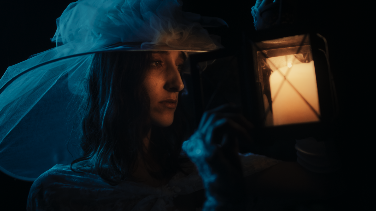
Another way to direct the viewers’ eyes is by having complementary colors. The reason why the teal and orange look is very much used in most films is that orange is close to the skin’s color and teal is the complementary color of orange.
The subject’s face is on the orange side making it pop out more because of the teal background. There are different variations of teal and orange but the main reason why we use them is the same.
The subject doesn’t blend in the frame
Color grading needs a lot of common sense.
Let’s say you have a scene where a guy is standing beside a purple neon light. It’s now color correction time and you noticed that the guy’s face is purple. Should you mask the guy’s face and balance it?
No.
It should be purple.
You are not grading a photograph, you are grading a movie where people are inside a location and they are experiencing the world around them. Removing the purple overcast on his will make the scene very fake because he, now, feels like not part of the scene.
When people are watching, they aren’t looking at the colors but things like this will distract them and will make them focus on the colors, instead of the story.
The grade distracts the viewers
Color grading can be very stylized. The look can be very saturated or contrasty. But, a professional colorist will find a way to make it non-distractive.
Just take a look at Zack Snyder’s films. They are too contrast and the shadows are crushed but when you’re watching the film, you can still focus on the story perfectly.
The best grade is the grade that makes you feel the emotions that the film is communicating but the viewers shouldn’t have any idea that the film was graded.
It should just feel like everything in the scene looks the way they are even though, in reality, it took a lot of process to get there.
Conclusion
I used to think that the more things you do to an image, the more quality it gets until I heard a story.
The story goes like this: “A mechanic was asked to repair a machine that’s not working properly. The mechanic, then, went to check to see what was wrong. Then, he grabbed a hammer and knocked a part of the machine then it started working again. The client was happy and asked how much it cost. The mechanic said it costs $10,000. The client was enraged and told him that what he did was just knock it with a hammer. The mechanic told him “Yes, it’s because of my knowledge and 30 years of experience that led me to know where and how strong should I knock the hammer.”
In color grading, the slightest move of the color wheel will make the scene a totally different one. We need to have the precision to know how much we should move the knobs and wheels.
Just like in the story, it may take us about a minute to land a specific look and that’s because of our years of experience to be able to create it with speed and accuracy.