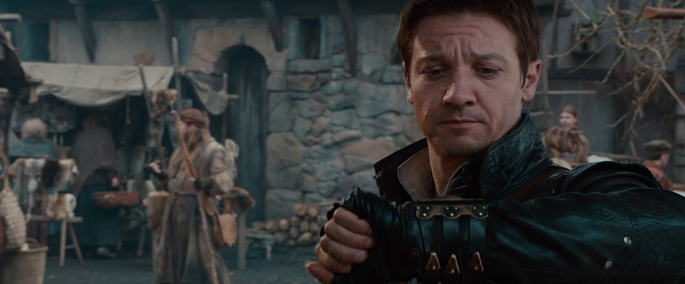
There wasn’t any new movie on Netflix yesterday so we decided to choose from the old ones that we loved. I chose Hansel and Gretel: The Witch Hunters since my daughter hasn’t watched it yet.
I can’t help but notice the grading whenever I’m watching a movie and I thought this movie’s grade won’t really catch my attention but I was blown away by how awesome the clean the color grading is.
I, instantly, search online to see who graded that film but there wasn’t any information. I checked IMBD and there was no credit for the colorist.
So, after the movie, I waited for the colorist to show. The credits were almost done when the colorist appeared.
And, it was Stefan Sonnenfeld.
I was like “that explains why the color grading is top notch!!!”.
Stefan Sonnenfeld is the President of the largest post-production company when it comes to color grading and finishing, Company 3. He graded tons of famous films.
I’ll name some of the films he graded:
- Top Gun: Maverick
- Jurassic World: Dominion
- Birds of Prey
- Avengers: End Game
- A Quiet Place
- Justice League (Znyder Cut)
- Pirates of The Caribbean: Dead Men Tell No Tales
Yes, that’s how legit this guy is. I have been binge-watching his films for education when I was just learning color grading but I didn’t know that he graded Hansel and Gretel: The Witch Hunter.
Maybe because his Instagram started in 2016 so there weren’t any Hansel and Gretel posts.
Anyway, I wanted to emphasize this because that film is one perfect example of the Teal and Orange Look. And, I’m going to explain in detail how to correctly execute this.
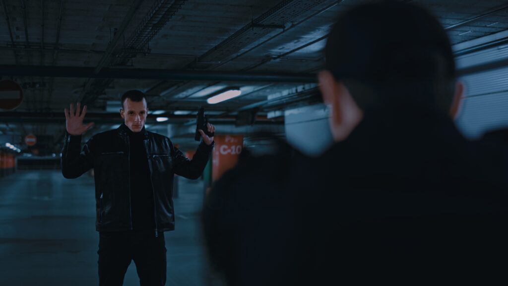
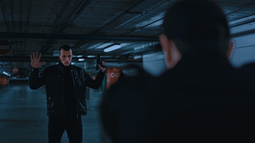
No matter how much you push the teals, make sure the blacks are pure black.
One of the mistakes most beginners make is that they move the entire offset towards teal or worse, they push the shadows to move towards teal.
Let me show you a series of shots with their corresponding waveforms.
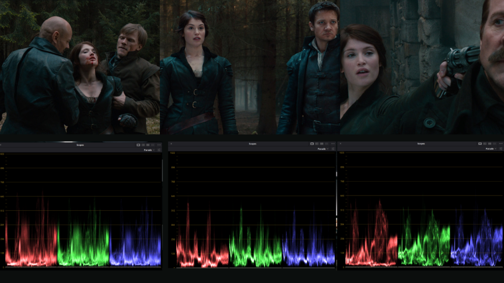
Can you see how balanced the shadows are? If you are new to scopes, let me give a brief explanation so you could relate. If the shadows have a blue overcast, the blues in the scope should be lifted. The lowest part of the blues shouldn’t be on the same level as the reds and greens.
Now, observing the scope, you’ll notice that the blues are almost the same level. It might be lifted by a bit but it’s still almost at the zero line where the shadows of the reds and greens are comfortably sitting.
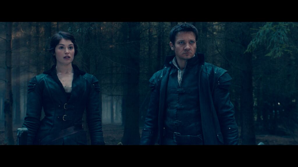
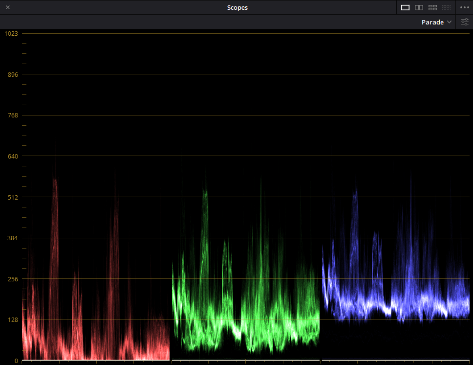
Let me show you an example of how a blue overcast in the shadows affects both the image and the waveform.
This is how it looks when we push the shadows toward blue.
And, this is the corresponding waveform.
I have made this mistake a lot of times when I didn’t learn color grading yet and I’m sure most of you might’ve done this too. If not yet, good for you because you don’t have to learn it the hard way.
Getting a teal and orange look doesn’t mean that you need to push your shadows to teal.
Looking at the image, it feels flat because pushing the shadows to blue gives you less color contrast. That leads us to number 2.
Create a nice color contrast as much as possible
Creating a teal and orange look doesn’t mean that we’re just going to make some parts teal and some parts orange. Those are what most of the LUTs sold online do.
The idea of a teal and orange look is to make the subjects pop out from the background even more. Since the skin is close to orange in the color wheel, teal is the perfect complementary color for it.
It doesn’t mean that we’re going to just make other objects teal.
Let us look at this example:
I graded this clip this way but before this, I almost forgot about the lights. It was teal!
Comparing the first still to the second, you’ll definitely say that the first one is better. It looks more natural and it simply feels more right.
It was a simple tweak of removing the overcasts from white and the difference is huge!
If you’re working with cinematographers and directors, they may say that it’s 99% there but they don’t know why they’re not feeling it yet. Chances are, it’s because there are objects in the frame that are distracting. It may be an oversaturated red mug on the desk or highlights with overcasts like the examples above.
Get clean selections when using qualifiers
If you’re going for a teal and orange look, chances are you’re going to qualify the skin or other warm tones in the frame. You have to make sure that you don’t introduce any artifacts that will make it obvious that you made a mistake in qualifying.
To create a perfect selection, the key is in balancing the image correctly before qualifying. This creates a good color separation between the objects in your frame.
It takes practice to master this correctly. Since you’ll be doing a lot of this in color grading, it’s totally worth your time and effort.
It also takes a lot of problem-solving in doing this. For example, the same image.
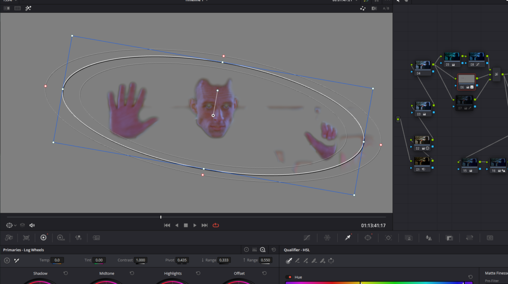
In the example above, the skin was perfectly selected. However, the walls behind him are also being selected since they’re orange. Refining the selection in the qualifier tab doesn’t get rid of the orange walls.
Do you think it’s correct to add a mask around the subject so that the walls won’t get selected? If you answered no, you’re correct.
Adding a mask on top of your qualifiers may solve a lot of problems in color grading but not this one. Since the subject and the camera are moving, some parts of the wall will be selected and the of those parts will be affected.
The best way is to include the orange walls in your selection and use the curves to specifically adjust them.
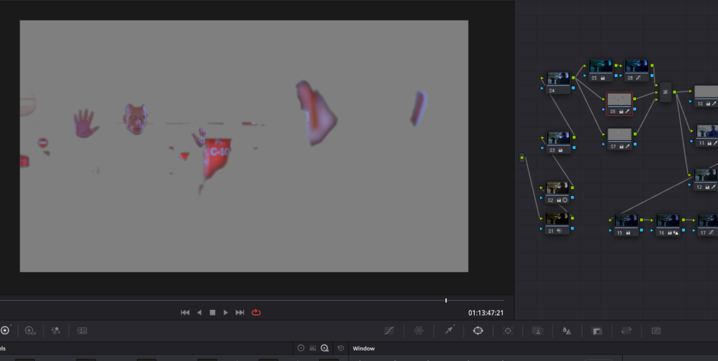
In this way, the goal is achieved and the adjustments are very clean.
Stick with the film’s look
Teal and orange in films have hundreds, if not thousands, of variations. Let me show some of them:
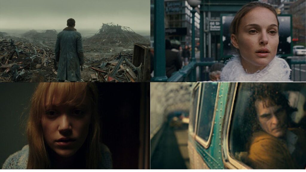
These teal and orange variations have their own unique style and vibe. You need to understand the unique DNA that the film that you’re grading has and not just do random teal and orange on every scene.
If the look DNA isn’t decided yet, it’ll be your job to create one and make sure that it’s possible to make it consistent throughout the film.
That transitions well to our next and last tip.
Do a lot of testing
By testing different teal and orange looks on a scene, you’ll be able to discover the best ones. I usually judge my grade by comparing them to different stills from different beautiful films.
By doing so, you’ll have a benchmark for your film. Ask yourself, what do my grade and that film’s look have in common? And, what are the differences?
Then, most of the time, you’ll know the answer. The advantage of this technique is that your judgment is more accurate when compared with others.
Have you ever tried editing or color grading? You’ve put a lot of effort into it. You created 15 different masks and you spent like 3 hours on a single clip. Then, you get tired. At the back of your head, it must look really good since you made extreme efforts.
Then, after waking up the next day, you look at it and you feel like it doesn’t look good anymore. It’s actually because after working so hard, you developed a bias for it.
So, the best way is to grab some stills of your favorite teal and orange films. Compare your work with them. They don’t have to match but by doing so, you can check where you can improve your grade.
Conclusion
The Teal and orange look is the most famous look in Feature films. Most films are teal and orange with just different variations so it’s best to master creating this look especially if you’re going to grade short films and feature films.
If you want to really master this technique, I recommend that you take Freelance Colorist Masterclass and see how a professional colorist creates this and other film-looks in real-time.